Neumorphism 2.0: The Future Of Soft UI Design
What is Neumorphism 2.0?
Introduction to Neumorphism 2.0:
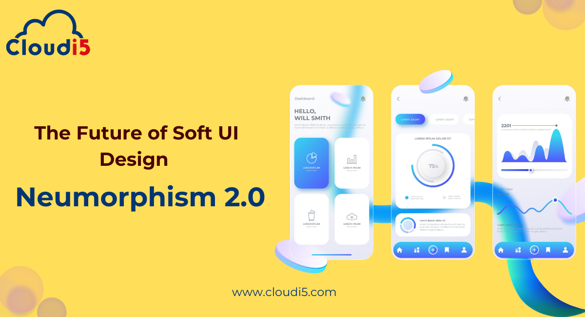
Neumorphism 2.0 is a modern design style for websites and apps that makes elements look soft and 3D. It uses subtle shadows and gradients to create the illusion that buttons, sliders, and cards are pressed into or popping out from the background. This gives the design a smooth, tactile feel, like you could touch the elements.
The main goal of Neumorphism 2.0 is to keep the design clean, sleek, and interactive while also being easy to use. It improves on the original Soft UI design by making interactive elements clearer and easier to find.
How Neumorphism 2.0 Differs from Traditional Design Styles:
- Soft 3D Look vs. Flat Design:
Traditional flat design uses simple, 2D shapes. Neumorphism 2.0 adds soft, 3D effects that make elements look like they’re raised or pressed into the background. This makes the design feel more interactive and realistic. - Simple but with Depth:
Neumorphism 2.0 is more minimalist than traditional designs. Instead of using bold colors or sharp lines, it creates a soft, layered look that’s gentle on the eyes, but still interesting. - Improved Usability:
One of the biggest problems with the original Soft UI design was that buttons and other clickable elements were hard to see. Neumorphism 2.0 solves this by making these elements clearer and easier to interact with.
Key Features of Neumorphism 2.0
Soft Shadows and Depth:
In Neumorphism 2.0, soft shadows create a 3D effect that makes buttons, cards, and other elements look like they are either pushed into or popping out of the background. These soft, gentle shadows make the design feel more realistic and interactive, helping users easily identify clickable items.
Minimalist Aesthetic:
Neumorphism 2.0 has a clean and simple look. It uses soft colors and smooth shapes to create a sleek and modern design. This minimalist style means the focus stays on the most important parts of the interface, making it easy to use and uncluttered.
3D Effect and Tactile Interfaces:
One of the coolest features of Neumorphism 2.0 is its 3D effect. Elements like buttons look like you can actually press or touch them, giving the interface a more interactive and real feel. This tactile experience makes it easier and more enjoyable for users to engage with the design.
Why Neumorphism 2.0 is the Future of Web Design
Modern Look & Feel:
Neumorphism 2.0 gives websites and apps a clean, futuristic look. It uses soft shadows and 3D effects to create a design that feels sleek and modern. This style makes digital elements look more real and interactive, which is exactly what users expect from today's design.
Enhanced User Interaction:
The design of Neumorphism 2.0 makes it easier for users to interact with your site or app. Buttons and sliders look like they are pressed or raised, so users know exactly where they can click or tap. This makes the interface feel natural and intuitive, improving the overall user experience.
Benefits for Mobile & Web Apps:
Neumorphism 2.0 is perfect for both mobile and web apps. It creates an interface that’s easy to use on smaller screens, making it feel like users are interacting with real objects. The design is touch-friendly, which makes it ideal for apps where tapping and swiping are key.
Improved Accessibility in Neumorphism 2.0
Making Design More Usable:
Neumorphism 2.0 makes designs easier to use by making things clearer and more intuitive. Unlike earlier designs, which could be confusing, Neumorphism 2.0 helps users know exactly where to click or tap, making navigation simple and straightforward.
High Contrast and Clear Visibility:
One of the issues with earlier Neumorphism designs was that elements weren’t always easy to see. Neumorphism 2.0 solves this by using higher contrast, making buttons and interactive parts stand out better. This ensures that everything is clear and easy to spot, even for users with visual impairments.
User-Focused Features:
Neumorphism 2.0 focuses on making the design better for everyone. It includes larger clickable areas, clear feedback when you click or hover, and better visibility, so users always know what to do. This makes the design not just pretty but also easy and practical to use.
How to Implement Neumorphism 2.0 in Your Website
Design Tools & Techniques:
To create Neumorphism 2.0 designs, you can use tools like Figma, Sketch, or Adobe XD. These tools help you design soft, 3D elements like buttons and cards. You’ll focus on adding shadows and gradients to make things look raised or pressed into the screen.
CSS for Shadows and Effects:
To bring Neumorphism 2.0 to life on your website, you’ll use CSS to add shadows and effects. For example, you can use the box-shadow property to make buttons look raised.
Best Practices for Clean Design:
Keep your Neumorphism 2.0 design simple and clean. Use soft, light colors and avoid too many shadows, which can make things look cluttered. Make sure clickable elements like buttons stand out and are easy to find, so users know where to click.
Neumorphism 2.0 in Real-World Web Design
Examples of Neumorphism in Action:
Neumorphism 2.0 is being used in real websites and apps to create sleek, 3D designs. For example, buttons and input fields look like they are either raised or pressed into the page. This makes the interface feel more interactive and fun to use. Think of a music app where buttons feel like you can press them, or a dashboard where sliders look like part of the screen—this is all Neumorphism in action!
Popular Brands Using Neumorphism 2.0:
Big brands like Apple and Spotify are starting to use Neumorphism 2.0. They use this design style for things like buttons, sliders, and cards in their apps. This style makes apps look modern, clean, and easy to use.
Conclusion
Neumorphism 2.0 is the future of web design, offering a modern and interactive look that makes websites and apps more engaging and easier to use. With its soft shadows, 3D effects, and minimalist style, it creates a sleek and user-friendly experience that’s perfect for both mobile and web platforms. As more brands adopt this trend, it's clear that Neumorphism 2.0 is here to stay. At Cloudi5 Technologies, we specialize in incorporating the latest design trends like Soft UI into your digital projects, helping you create fresh, clean, and intuitive user experiences. Let us help bring your vision to life with the power of Neumorphism 2.0!
Trusted By


Leave Comments